Trick | Brand Identity
World Class Cuisine with an Indian Twist
Trick is an up & coming bar based out of Hyderabad. Due to its concept of being constructed in a way that seems bigger than what it actually is, and also to show it in a way of more than what meets the eye, the founders felt that the name Trick made perfect sense to the place. I took this as an opportunity to translate this character of the place and the name into the brand identity as well.
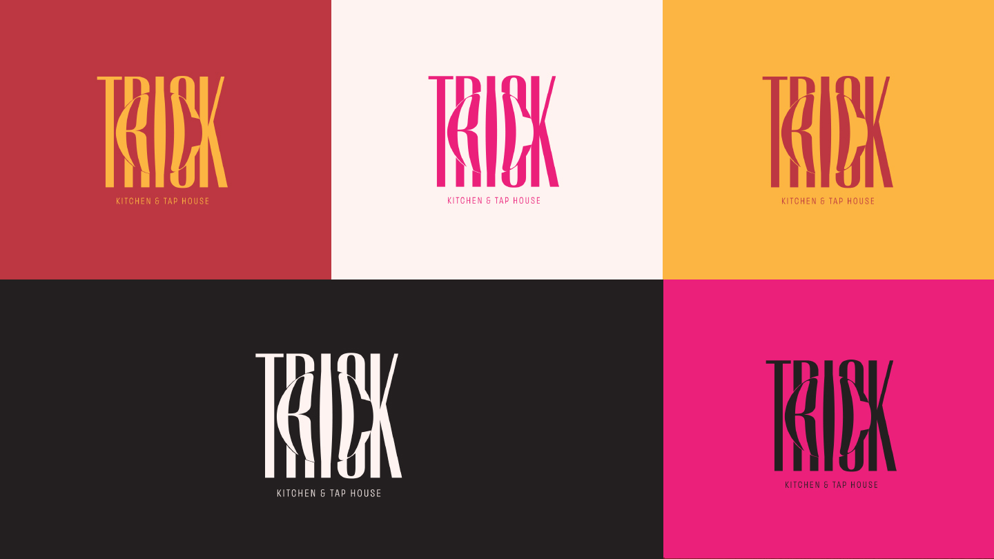
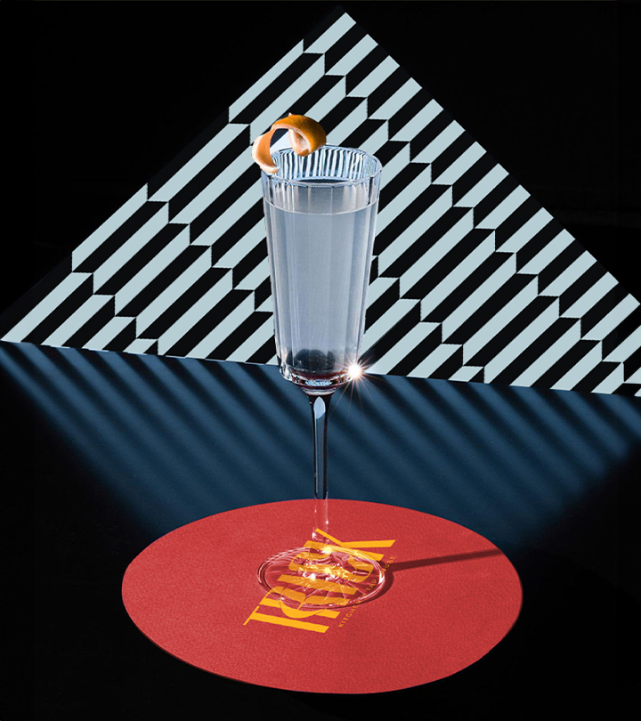
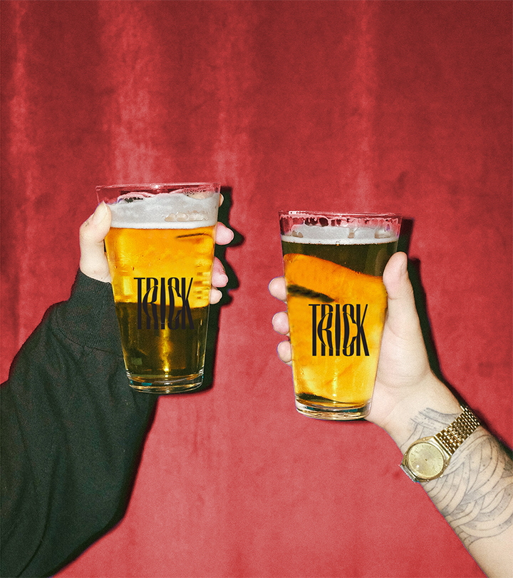
The wordmark conveys the idea of the resto-bar using concepts of distortion, optical illusion and visual trickery.
Process
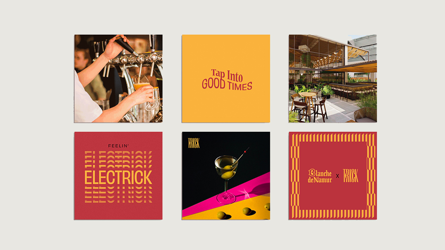
Pranay & Rohan, who were also the founders of 10 Downing Street, came to us with the name 'Trick' and renders of their place. They described the cuisine as, Indian food with a global twist. Their presentations of the food would be dramatic and visually enticing. The personality of the brand is that of an entertainer who’s a lovable, wonderful yet witty a host, tries their best to perform all the cool tricks they have up their sleeves. I wanted the wordmark to convey the core concept, by giving it a sense of visual trickery, depth & optical illusion to it. I looked at concepts such as refraction of light, distortion of text, as the inspiration of the logo. We also wanted to showcase the brand with a dramatic flair, which led to a colour palette with red, yellow & the hot pink.
result
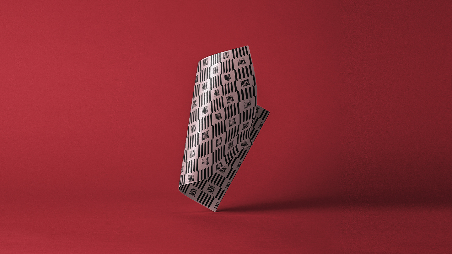
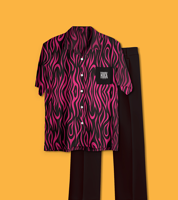
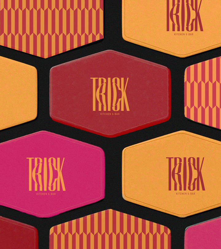
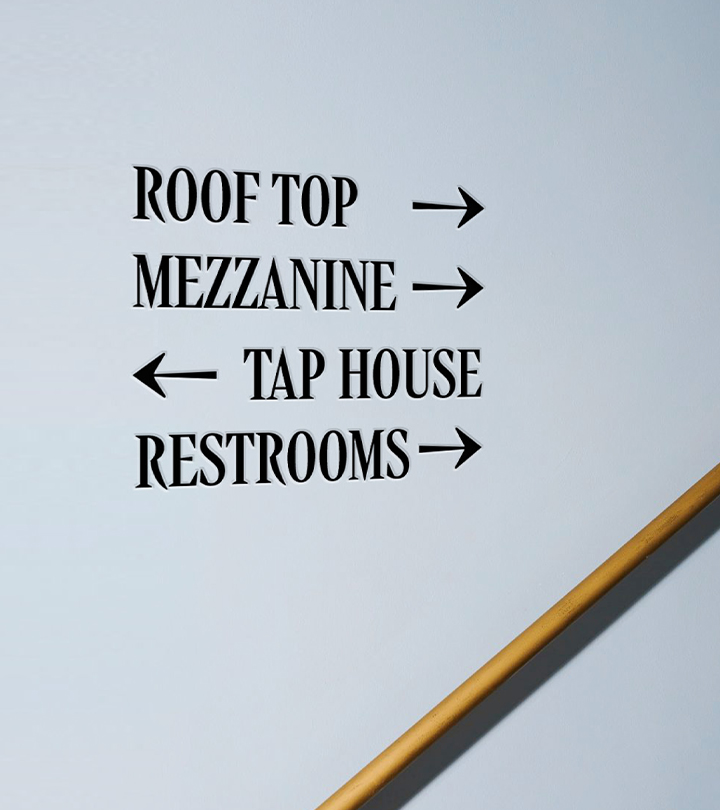
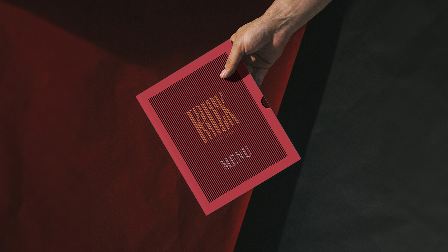
We wanted to carry out the theme throughout the identity. So we came up with few physical touchpoints such as lenticular printing techniques for the menu & convex mirrors for restrooms, a huge blown up happy hours menu, which could be a gamified version of a regular menu, making it more fun to read etc. Check out Trick's Instagram and see how it looks IRL
credits
Agency: Studio 318
My Role: Lead Brand Designer & Strategist, Project Manager
Team: Samhitha Chitturi (Jr. Brand Designer), Rachana Kari (Creative Director)
