Gender at Work India | Brand Identity & Guidelines
Inclusive, Intersectional, Institutional Change
Being a rebranding project, Gender at work India came with a challenge of creating an identity that visually represented the kind of work they do in the field of gender equity & inclusivity in the country. Being a firm believer and strong advocate for their cause, working for the project was a dream come true for me. Getting to do this with amazing clients & team gave me so much joy and an oppurtunity to give back to the community through designing for a brand that does such important, need-of-the-hour work.
Being set in the Indian context, it was extremely important for the brand to resonate the culture visually, especially through it's colours & communication.
Problem
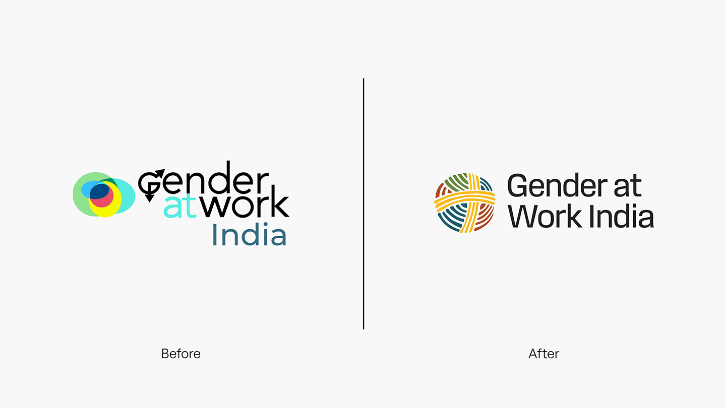
After a thorough study of the existing brand, we identified the problems and few things that didn't align with the brand's vision. There was no consistency in the brand language which was being used. It didn't feel regional or colloquial enough. The design felt very binary and restrictive considering the fact that how much the brand had evolved since their previous branding activity.
Process
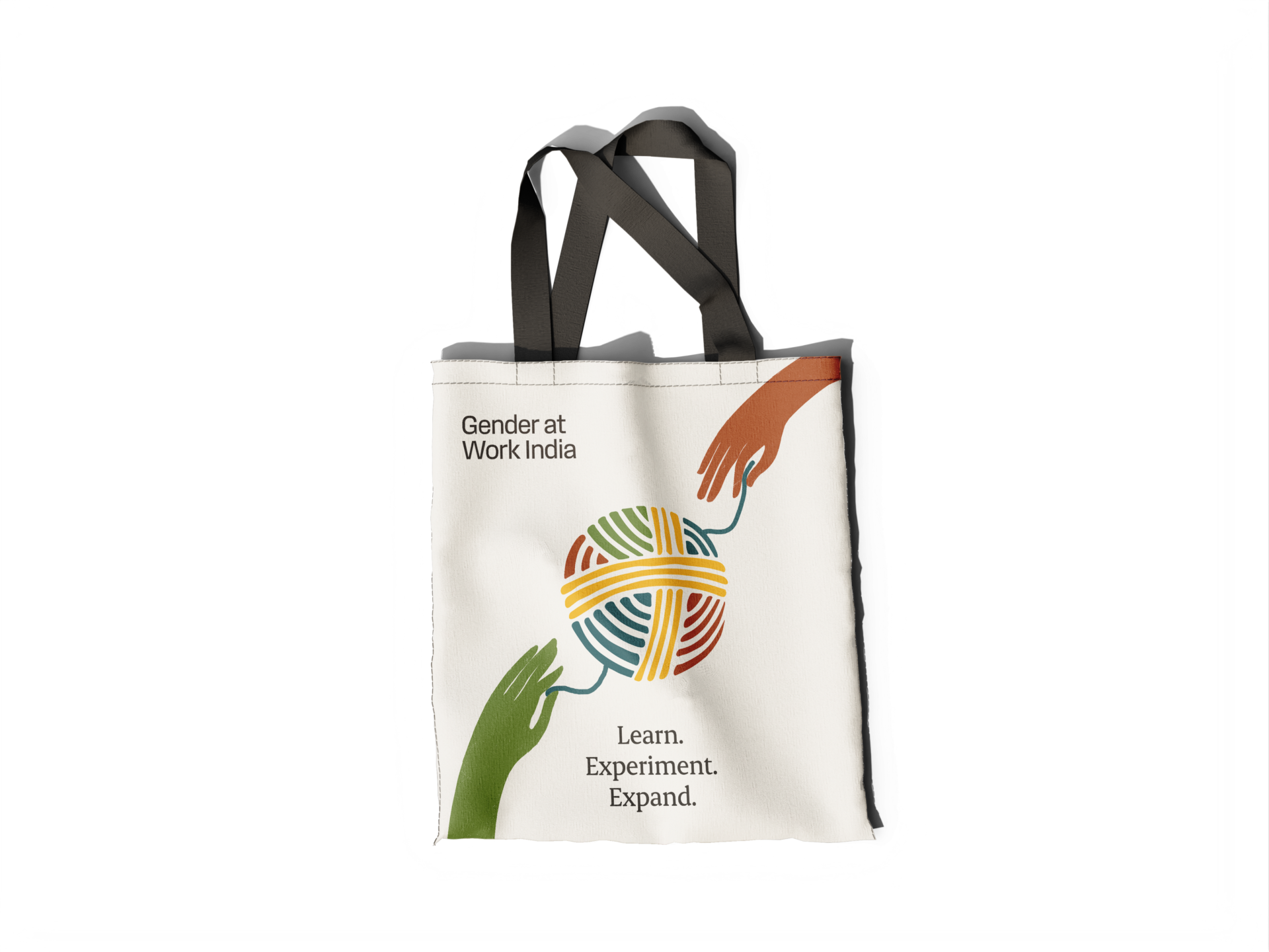
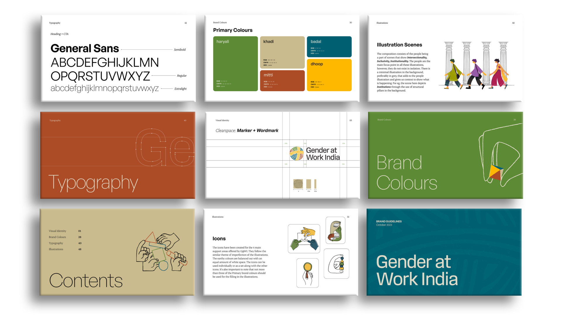
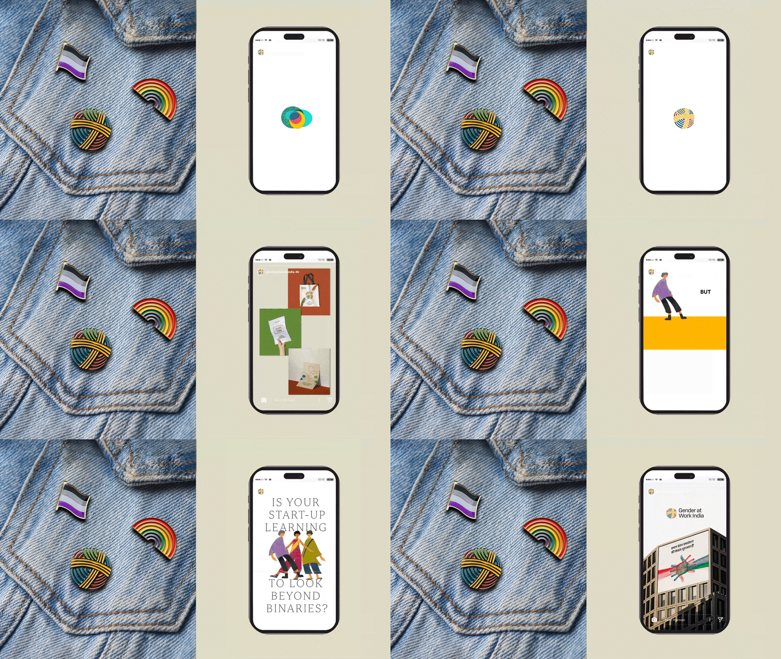
I wanted a logo mark to stand for the diverse community it had, the several intersections it worked with, the widespread network it had down to the grassroots level. Being set in the Indian context, it was incredibly important for the brand identity to reflect that. The colour palette were carefully chosen to represent this aspect. Terracotta, Khadi, Mitti, Indigo etc. were few of the inspirations that I had in mind while building this. After several brainstorming sessions with the strategy team, I came up with the logo, which symbolised the yarn ball and felt like the perfect for this brand, which was built with a tight knit diverse community through & through since day one.
Result
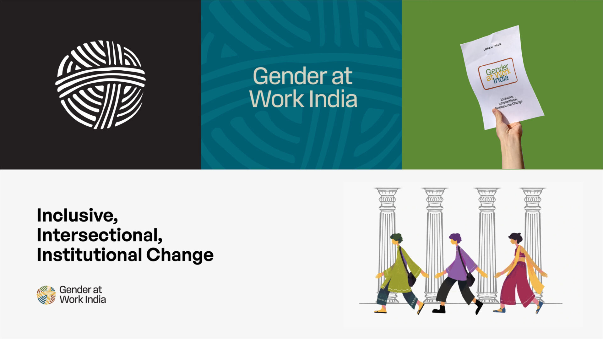
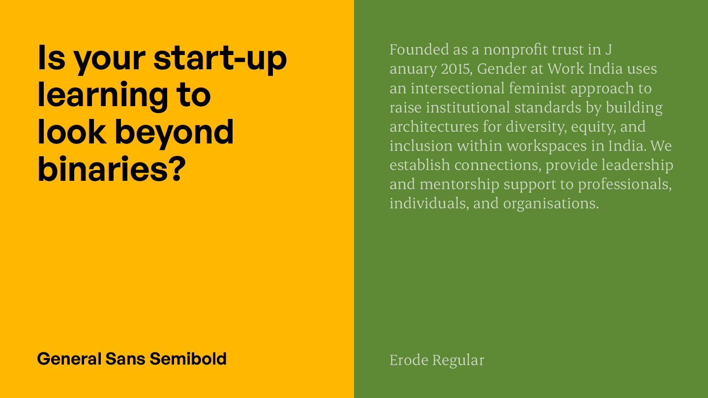
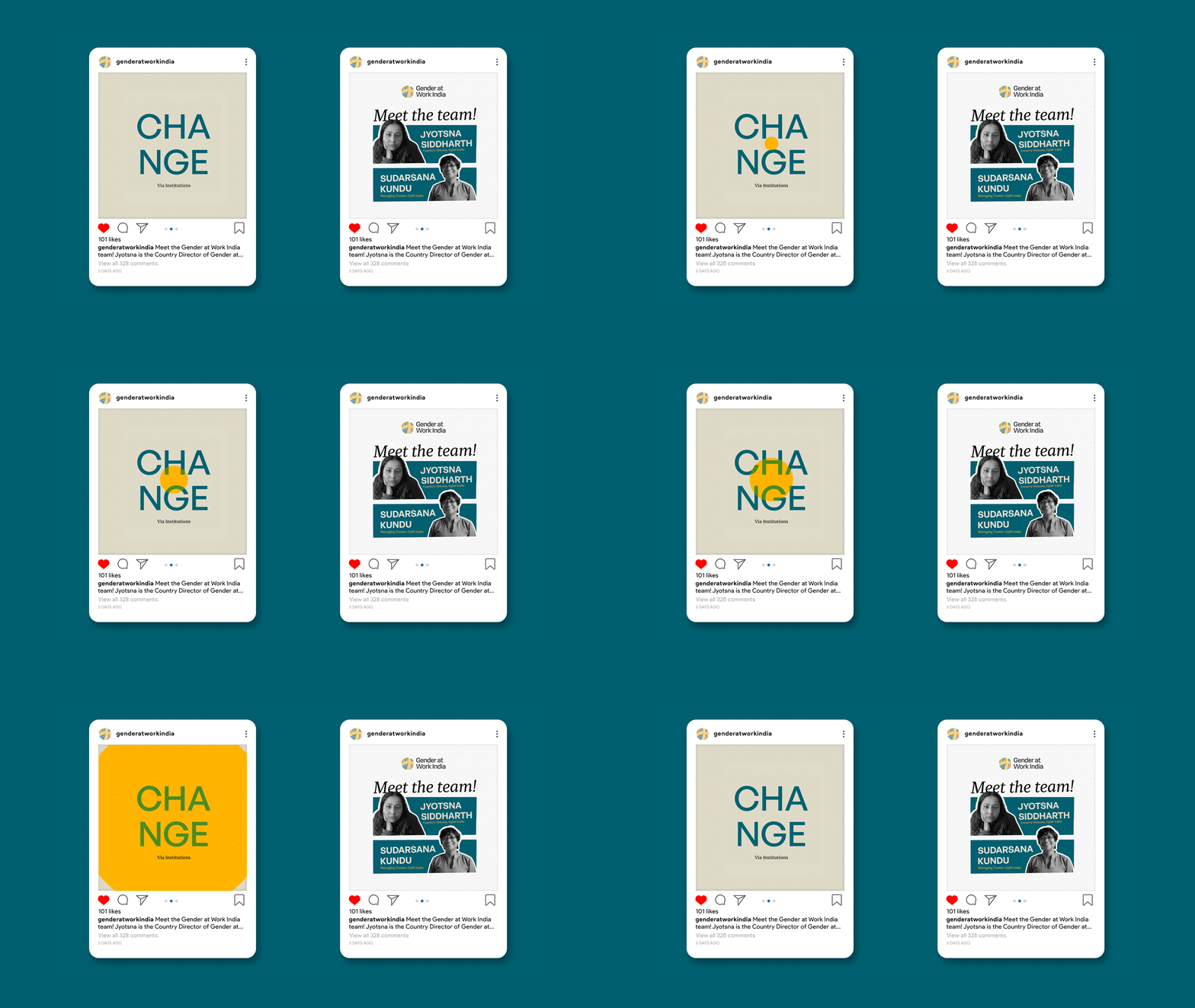
It was extremely important to establish a strong system for the brand to take their new identity further while keeping it consistent. After an analysis of several touchpoint the brand would be interacting with, I created up a set of brand guidelines that defined that wordmark, logo mark & colour usage, font pairings, icon & illustrations style etc. We created a set of illustrations & icons to get the brand started out with. Illustrations of people with no specific gender, represented in a style far from the depictions we usually see of gender in the typical heteronormative society we live in. Our intentions & ideas were met with so much genuine, heart-felt appreciation from the Gender at Work India's team when we presented the rebrand to them.
Credits
Agency: Studio 318
My Role: Brand Designer, Project Manager
Team: Mansi (Content Strategy) , Miloni (Illustrations)
