Trē Wellness | Brand Identity & Guidelines
A space to connect with your mind, body & soul
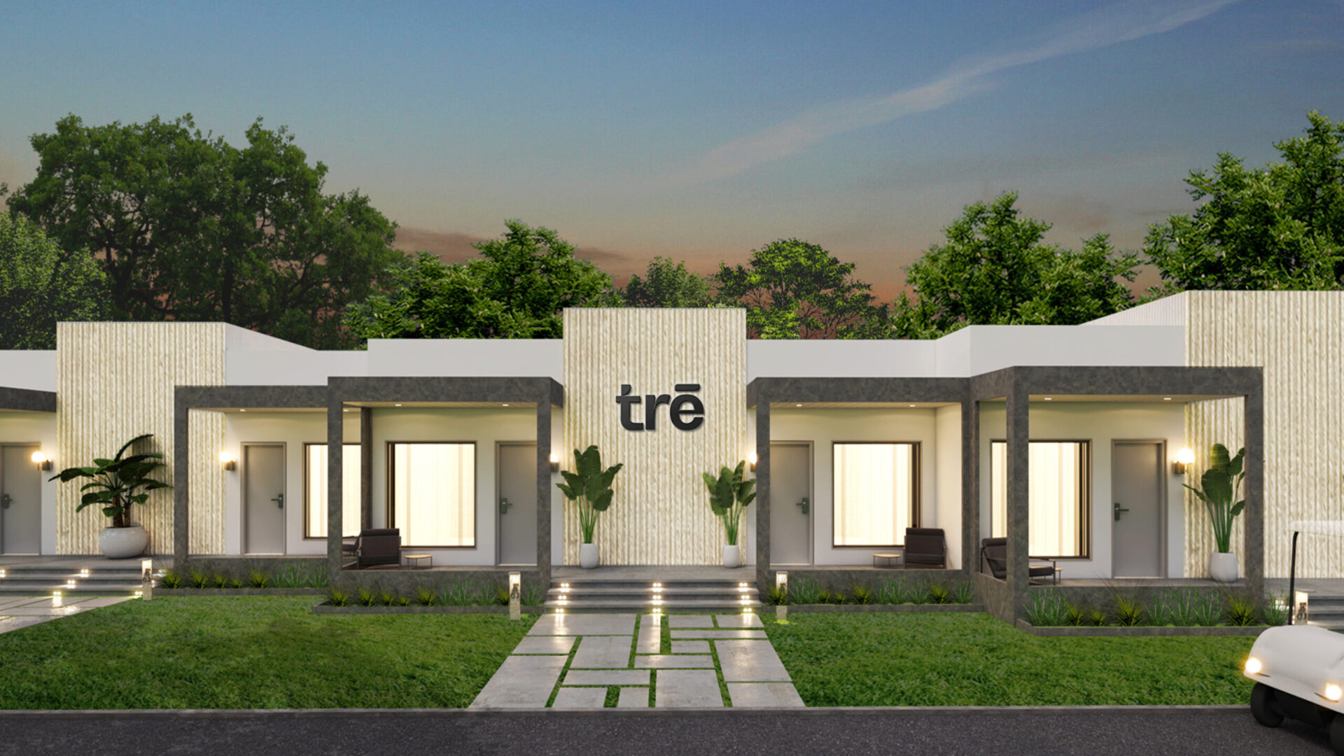
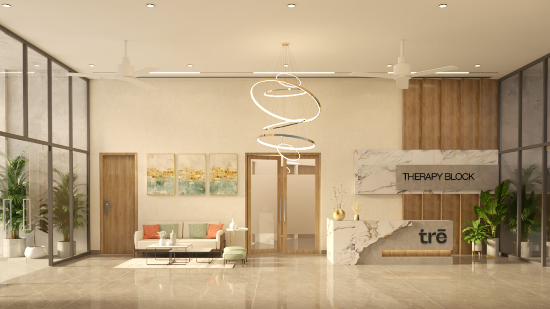
Being a first-of-its-kind in the city of Hyderabad, Trē was built in a very contemporary, minimal, luxurious way and the founders wanted the brand’s identity to reflect that. They offered services such as ayurveda, naturopathy etc. but wanted to move away from typical rustic indian aesthetic every other wellness resort had in the country.

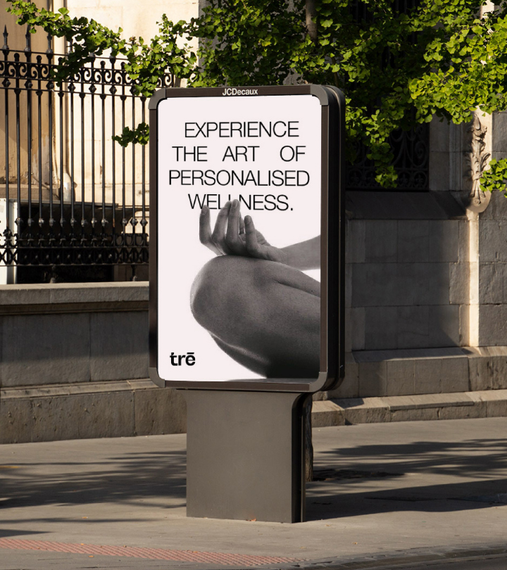
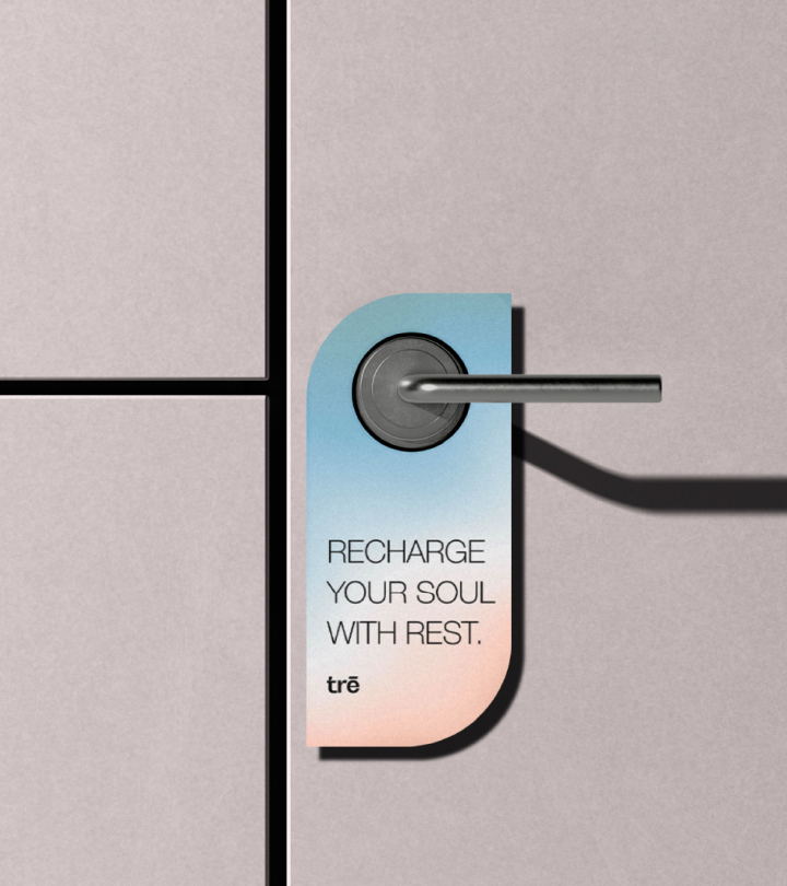
The brand identity process began with an in-depth research to understand some of the best branding & customer experience practices followed by well-known wellness resorts worldwide.
Problem
When it came to luxury wellness centres within the country, there were no resorts that felt contemporary, comfortable, and luxurious to stay at with the same seriousness of a naturopathy centre. Most of the expensive ones, felt like a spa without any focus on healing you and the serious nature cure hospitals, were not at all comfortable to stay at and had a lot of restrictions when it came to food. This gap in the wellness resort industry was one of the main reasons for the founders to start a place that would feel very modern & luxurious to stay at, set amidst nature with several professional healthcare practitioners from all over the world dedicated to address & resolve health ailments of the guests.
Process
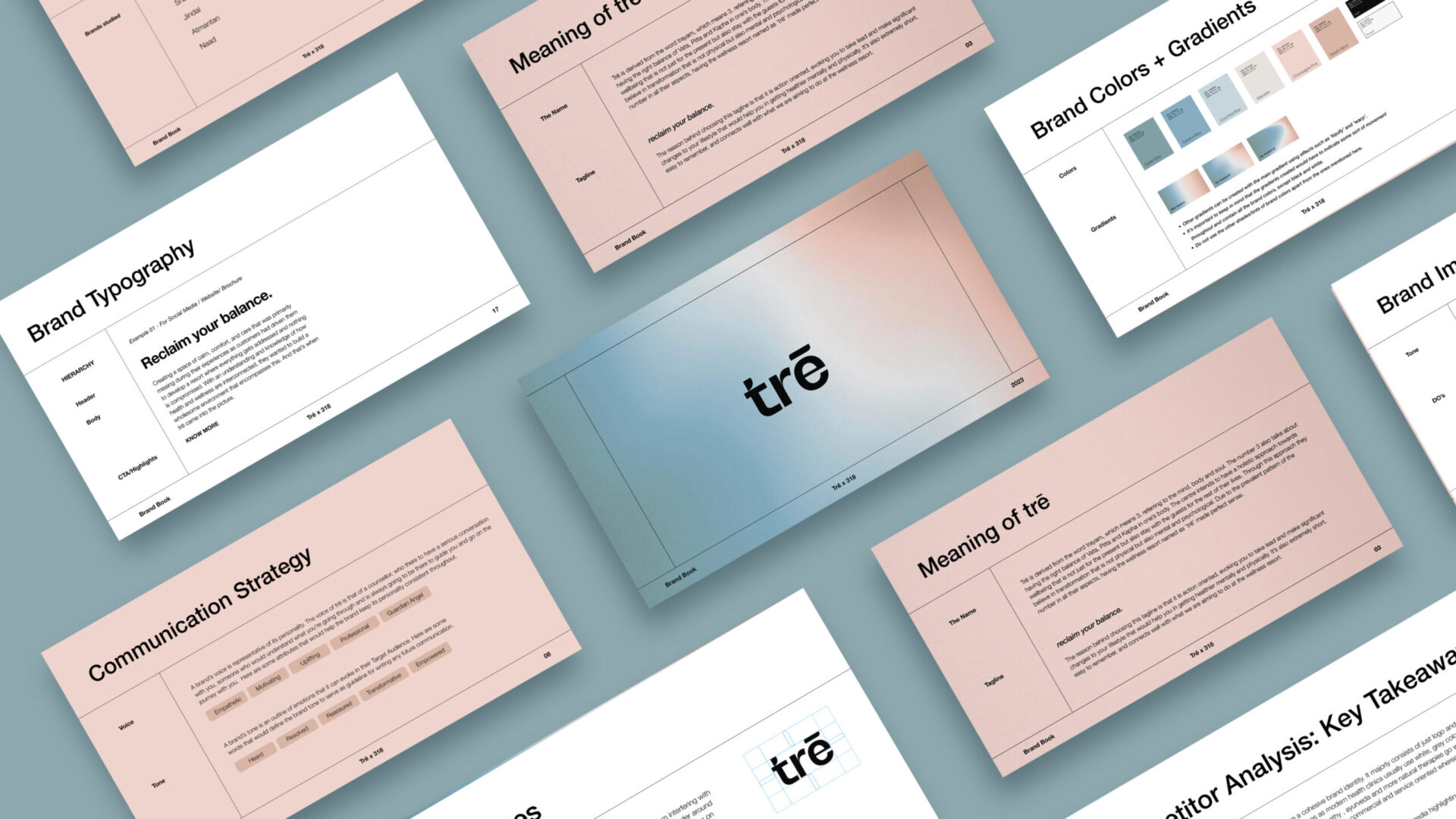
I was entrusted with the project from the start to the finish. It began with research, which helped me understand what were some of the best practices that the top brands in the industry were practicing. After that we moved on to naming the brand. Seeing the renders of the place also helped us gain some more clarity and helped the process. After several discussions, we landed on the name ‘tre’, which meant the number three, an ode to their core belief of working together with the mind, body and soul. The brand identity process began with several explorations of a wordmark for the name, I worked on three options in three different directions as per the brief that was given by the client. All the three with a different look and feel, keeping the central concept same. The one that is shown over here, is the chosen one.
Result
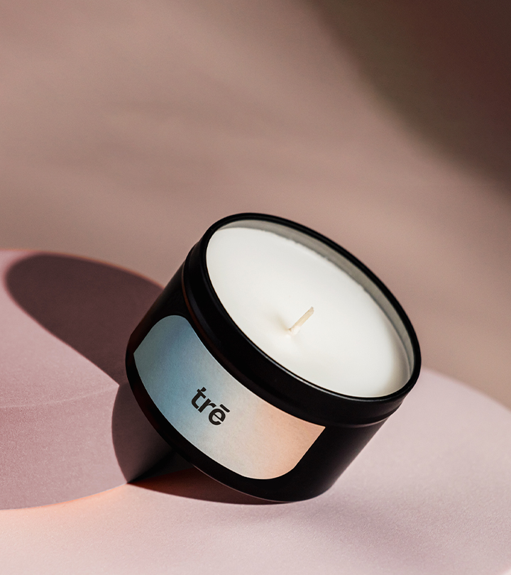
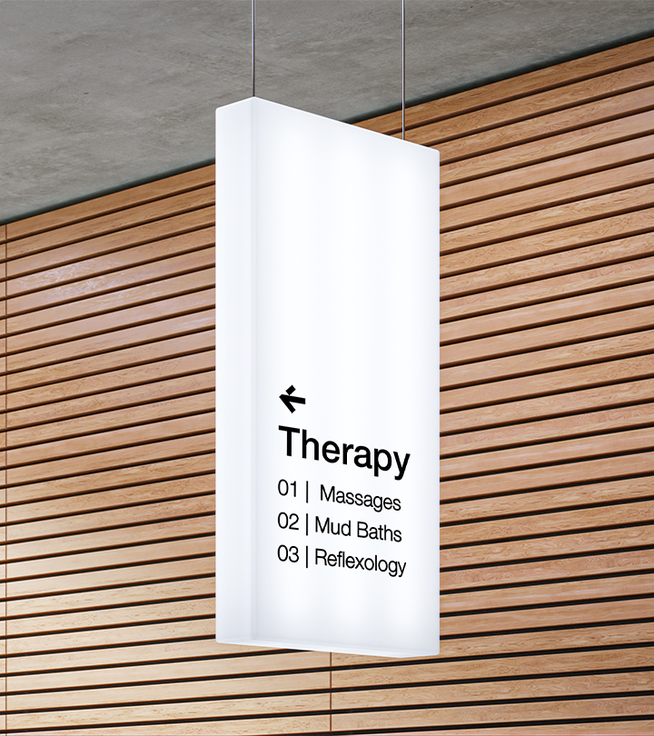
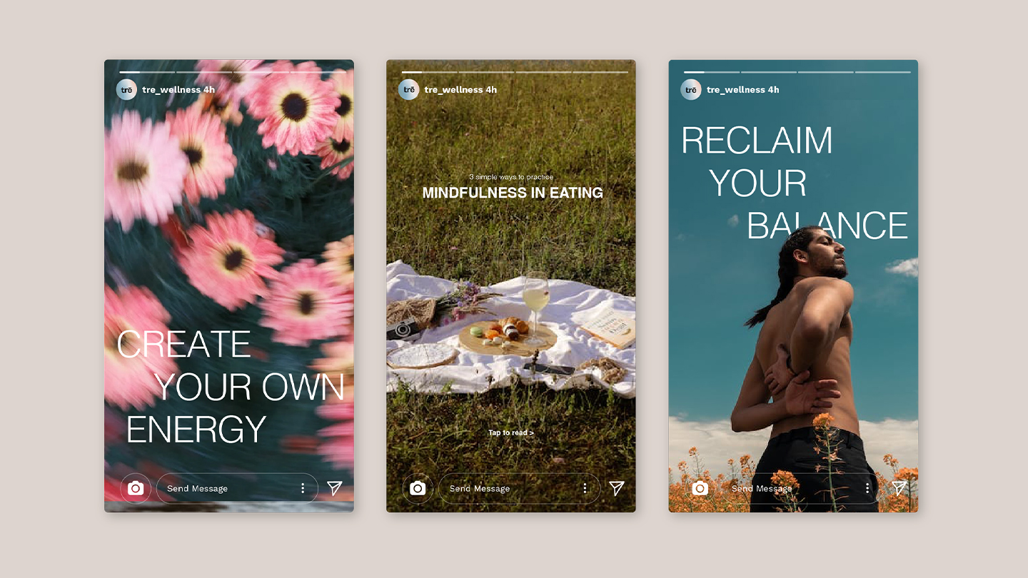
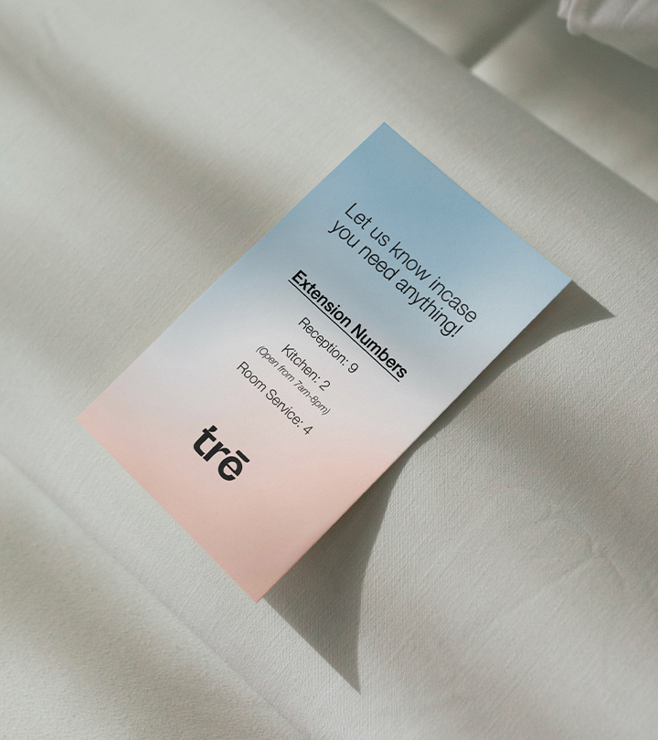
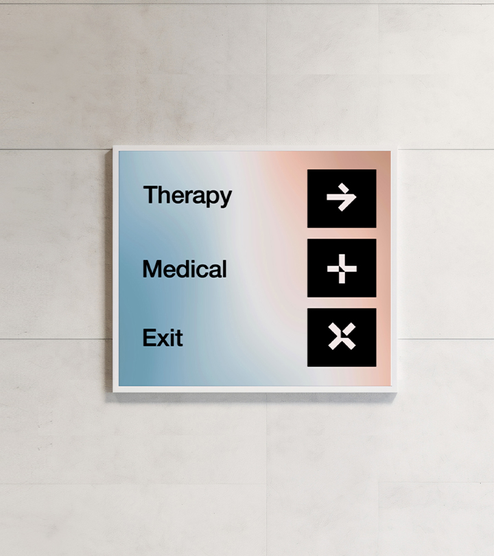
It was crucial for the entire identity to evoke a sense of calmness and warmth. We chose both cool and warm colours that were very easy on the eyes, used them in a gradient version, that signifies change and growth through its movement. For the brand fonts, we wanted something that were extremely stripped down, straightforward and simple which conveyed that seriousness of the place. Being a brand that wanted to be minimal, so we extracted a symbol (the bar on ‘e’) from the wordmark that can be used throughout the brand collaterals both print & digital.
Credits
Agency: Studio 318
My Role: Brand Designer, Project Manager
Team: Rachana Kari (Creative Director)
My Role: Brand Designer, Project Manager
Team: Rachana Kari (Creative Director)
